
3.10. Tutorial Exercises#
You should work through this is the tutorial. The idea is to bring together the skills you have learned (and highlight any gaps to discuss with your tutor)
Oxford weather station data#
We will work with historical data from the Oxford weather station

Set up Python libraries#
As usual, run the code cell below to import the relevant Python libraries
# Set-up Python libraries - you need to run this but you don't need to change it
import numpy as np
import matplotlib.pyplot as plt
import scipy.stats as stats
import pandas
import seaborn as sns
sns.set_theme()
Load and inspect the data#
Let’s load some historical data about the weather in Oxford, from the file “OxfordWeather.csv”
weather = pandas.read_csv("https://raw.githubusercontent.com/jillxoreilly/StatsCourseBook/main/data/OxfordWeather.csv")
display(weather)
| YYYY | MM | DD | Tmax | Tmin | Tmean | Trange | Rainfall_mm | |
|---|---|---|---|---|---|---|---|---|
| 0 | 1827 | 1 | 1 | 8.3 | 5.6 | 7.0 | 2.7 | 0.0 |
| 1 | 1827 | 1 | 2 | 2.2 | 0.0 | 1.1 | 2.2 | 0.0 |
| 2 | 1827 | 1 | 3 | -2.2 | -8.3 | -5.3 | 6.1 | 9.7 |
| 3 | 1827 | 1 | 4 | -1.7 | -7.8 | -4.8 | 6.1 | 0.0 |
| 4 | 1827 | 1 | 5 | 0.0 | -10.6 | -5.3 | 10.6 | 0.0 |
| ... | ... | ... | ... | ... | ... | ... | ... | ... |
| 71338 | 2022 | 4 | 26 | 15.2 | 4.1 | 9.7 | 11.1 | 0.0 |
| 71339 | 2022 | 4 | 27 | 10.7 | 2.6 | 6.7 | 8.1 | 0.0 |
| 71340 | 2022 | 4 | 28 | 12.7 | 3.9 | 8.3 | 8.8 | 0.0 |
| 71341 | 2022 | 4 | 29 | 11.7 | 6.7 | 9.2 | 5.0 | 0.0 |
| 71342 | 2022 | 4 | 30 | 17.6 | 1.0 | 9.3 | 16.6 | 0.0 |
71343 rows × 8 columns
Max and Min temperature#
Let’s make two figures using box plots (or violin plots, you choose) to display the distribution of:
- Tmax (max temperature over 24 hours)
- Tmin (min temperature over 24 hours)
Make your figures as subplots in a larger figure so they sit next to or one above each other - you decide which is allows for a more meaningful comparison
Consider the range of the axes to make the plots easy to compare.
You might want to increase the spacing between plots - you can find a line of code for this on the ‘tweaks’ worksheet
# your code here!
Which did you choose - box plot or violin plot? Why?
Let’s try the same thing but comparing mean temperature (Tmean) and rainfall - the relationship isn’t nearly as clear
# your code here for boxplots or violin plots for Tmean and Rainfall_mm
Scatterplot#
Let’s make a scatterplot of two variables that should definitely be related - Tmin and Tmax, the daily minimum and maximum temperature (say on 21st June the temp peaks at 25 degrees in mid afternoon, but falls to 8 degrees by 3am: Tmax=25 and Tmin=8 for that day)
# your code here to make the scatterplot!
We see that Tmin and Tmax are indeed related, but there are some days with a large temperature range (high TMax and low Tmin) and others with a low range (Tmax and Tmin nearly equal).
Add the line x=y to the plot so you can see where the data would fall if Tmax=Tmin on a given day.
# your code here!
Let’s plot the daily temperature range (Trange) in each month to find out if there is a pattern.
Choose an appropriate plot for this yourself.
# Your code here!
It seems months with higher temperatures also have a larger daily temperature range.
Temp vs rainfall#
We have seen that rainfall is fairly evenly spread over the months and temp is not. But is there any relationship between rainfall and temperature on a day-by-day basis?
Make a scatterplot to find out!
# your code here!
Interesting, it looks almost like high rainfall is more likely on warm days, but the plot is so crowded it is a bit hard to tell
Fancy joint plots#
You can use the function sns.jointplot that we saw before (scatterplot plus the two marginal histograms) to make some fancy plots!
Let’s revisit the relationship between Tmin and Tmax
sns.jointplot(data=weather, x='Tmin', y='Tmax')
<seaborn.axisgrid.JointGrid at 0x7faf4e915be0>
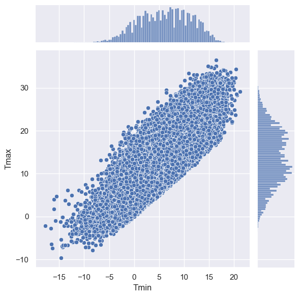
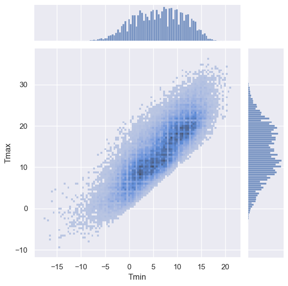
That scatterplot is too crowded. How about a 2D histogram in which shading indicates the count of datapoints in each square?
sns.jointplot(data=weather, x='Tmin', y='Tmax', kind='hist')
<seaborn.axisgrid.JointGrid at 0x7faf50438e80>
Or a join kde plot? Change ‘kind’ to kde above
Or how about a hex plot? Change ‘kind’ to hex above
You can find many more nice examples in the Seaborn Gallery - why not try some out? If you click on any of the pictures of plots you get the code snippet for the plot.