3.6. Scatterplot#
If we want to see the relationship between paired measurements, a scatterplot is a good choice
Examples would be:
- Heights of brothers and sisters
- A patient's blood pressure before and after taking a drug
- Reaction time on the same task with and without distraction
Example: brother/sister heights#
A researcher hypothesises that men are taller than women.
He also notices that there is a considerable genetic influence on height, with some families being taller than others
He decides to control for this by comparing the heights of brothers and sisters (shared genetic influence, shared upbringing). This is a paired design.
Set up Python libraries#
As usual, run the code cell below to import the relevant Python libraries
# Set-up Python libraries - you need to run this but you don't need to change it
import numpy as np
import matplotlib.pyplot as plt
import scipy.stats as stats
import pandas
import seaborn as sns
sns.set_theme()
Load and inspect the data#

Load the file BrotherSisterData.csv which contains heights in cm for 25 brother-sister pairs
heightData = pandas.read_csv('https://raw.githubusercontent.com/jillxoreilly/StatsCourseBook/main/data/BrotherSisterData.csv')
display(heightData)
| brother | sister | |
|---|---|---|
| 0 | 174 | 172 |
| 1 | 183 | 180 |
| 2 | 154 | 148 |
| 3 | 172 | 180 |
| 4 | 172 | 165 |
| 5 | 161 | 159 |
| 6 | 167 | 159 |
| 7 | 172 | 164 |
| 8 | 195 | 188 |
| 9 | 189 | 175 |
| 10 | 161 | 160 |
| 11 | 181 | 177 |
| 12 | 175 | 168 |
| 13 | 170 | 169 |
| 14 | 175 | 165 |
| 15 | 169 | 164 |
| 16 | 169 | 163 |
| 17 | 180 | 176 |
| 18 | 180 | 176 |
| 19 | 180 | 172 |
| 20 | 175 | 170 |
| 21 | 162 | 157 |
| 22 | 175 | 172 |
| 23 | 181 | 179 |
| 24 | 173 | 171 |
Independent KDE plots#
Let’s use a KDE plot to compare the heights of the men (brothers) and women (sisters) in the sample.
We can call KDE plot twice to plot the data from brothers and sisters overlayed
sns.kdeplot(heightData["brother"],  color='b',  fill='true', label='brother')
sns.kdeplot(heightData["sister"],  color='r',  fill='true', label='sister' )
plt.xlabel('height (cm)')
plt.legend()
<matplotlib.legend.Legend at 0x7ff21a937df0>
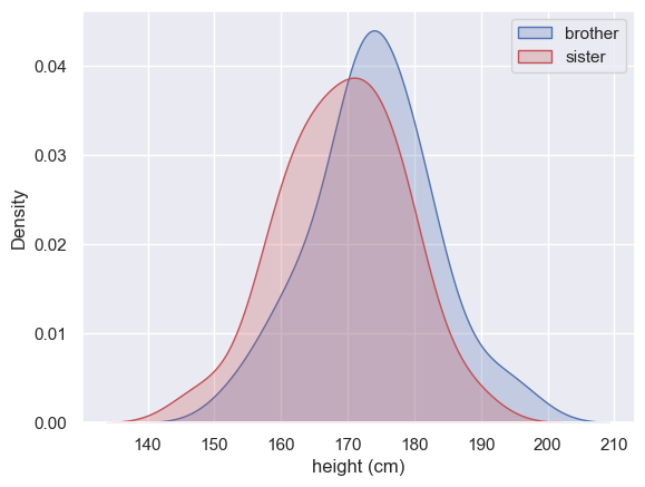
There’s a lot of overlap for sure, and just a hint that the men are taller than the women.
But comparing all the men to all the women is wasting the power of our paired design!
Scatterplot#
On a scatterplot, each dot represents two paired datapoints - a brother and sister:
sns.scatterplot(x=heightData["brother"], y=heightData["sister"])
<Axes: xlabel='brother', ylabel='sister'>
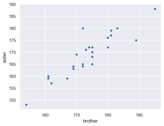
One thing we can clearly see is that tall brothers tend to have tall sisters - that is there is a shared familial effect, or to put it another way, height of brothers aand sisters is correlated across families.
This suggests it was a good idea to use a paired design as what we really want to know is not whether some families are taller than others, but whether the male sibling in each family is taller than the female sibling once the family effect is accounted for (by compaaring only within families). To help us visualise this we add a reference line
Reference line#
Let’s add the line x=y to help us interpret the data.
If all the brothers were exactly the same height as their sisters, we would expect all data points to fall exactly on the line x=y
If brothers were roughly the same height as their sisters (with some random variation) we would expect the data points to fall equally often above and below the line x=y
If brothers are generally taller than their sisters, most of the datapoints will fall on one side of the line (think about which!)
To add the line x=y we use the matplotlib function plot. The arguments of this function are the x and y values for the ends of the line (x and y both range from 150-190), and the argument ‘k–’ which sets the color and line type.
- See if you can add another line of code to draw a red horizontal line at y=170
sns.scatterplot(x=heightData["brother"], y=heightData["sister"])
plt.plot([150, 190],[150, 190], 'k--')
#plt.plot([150, 190],[150, 190], 'r:')
# edit this code to plot a horizontal line at y=170,
# that is a line between [150 190] in x and [170 170] in y
[<matplotlib.lines.Line2D at 0x7ff21ac84340>]
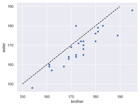
In fact, most of the datapoints fall on one side of the line (below it)
- This means either than most of the brothers are taller than their sisters, or vice versa - which is it (look at the graph)?
Correlation#
Notice that in the scatterplot, the data points are spread out along the line x=y.
This means that in general tall brothers have tall sisters and this variation between families rather dwarfs the effect of interest (that within each family the brother is taller than his own sister)
This feature of the plot is evidence that a paired design was a particularly good choice for this question - in the paired design, the (large) variation between families is cancelled out allowing us to detect the (small) difference between male and females.
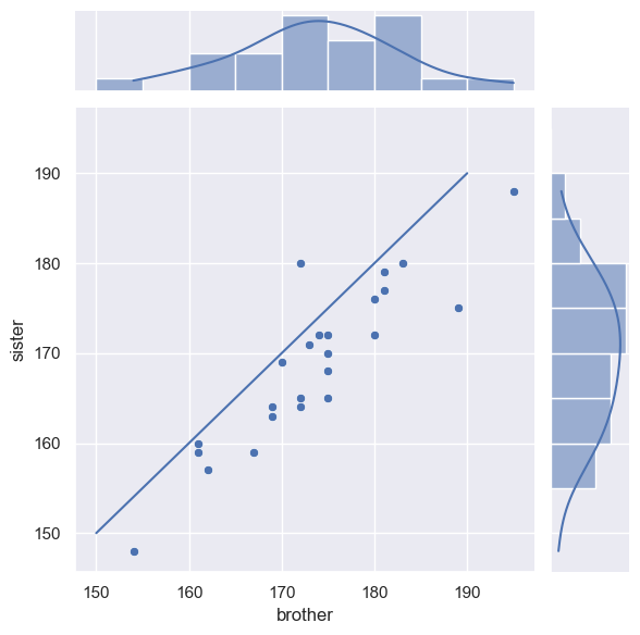
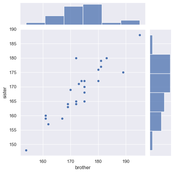
Jointplot#
It was nice to be able to see the distribution for each group (brothers and sisters) in the KDE plots, but the KDE plot didn’t show the relationship between brothers and sisters
It was nice to see the relationship between brothers an dtheir sisters in the scatterplot, but it is hard to get a sense of the distribution
We can get the best of both worlds by useing seaborn function jointplot, which shows the marginal distributions (the height distributions for brothers and sisters separately) at the side of the main scatter plot
sns.jointplot(x=heightData["brother"], y=heightData["sister"])
<seaborn.axisgrid.JointGrid at 0x7ff21aecee20>
We can adjust the bins and add a KDE plot if we like:
sns.jointplot(x=heightData["brother"], y=heightData["sister"], marginal_kws=dict(bins=range(150,200,5), kde="true"))
<seaborn.axisgrid.JointGrid at 0x7ff21b1fdd30>
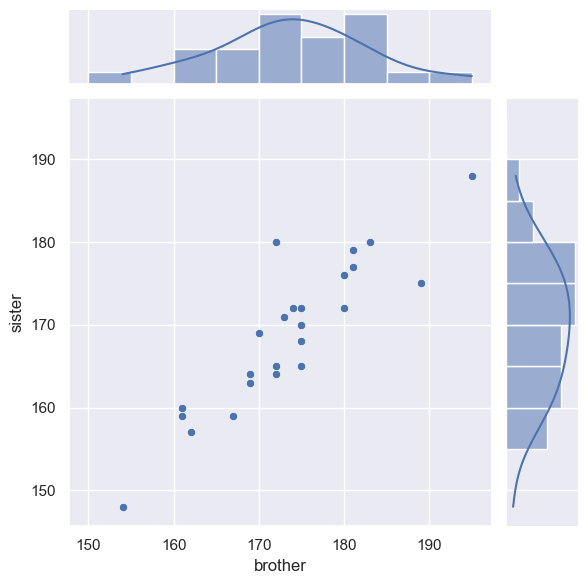
Finally, we can add the line x=y.
This is a little fiddly as we have to tell the computer which part of the the joint plot to add the line to, by getting a handle to the plot (see comments in the code)
# create the joint plot as before but give it a label - "myfig"
myfig = sns.jointplot(x=heightData["brother"], y=heightData["sister"], marginal_kws=dict(bins=range(150,200,5), kde="true"))

# plot the line x=y onto the joint axis (ax_joint) of myfig
myfig.ax_joint.plot([150,190],[150,190])
[<matplotlib.lines.Line2D at 0x7ff21bb67d60>]