
3.7. Plotting with Pandas#
The Seaborn plotting library is designed to be used with Pandas.
For example, if we want to plot one variable (say age) separately based on another variable (say, which class someone travelled in), we can do it very easily with Seaborn
Example: Titanic data#
Let’s use the Titanic passenger data again!
By the way you can find a description of the dataset including explanations of some of the less obvious column titles, on kaggle - a data science website that I got the data from
Set up Python libraries#
As usual, run the code cell below to import the relevant Python libraries
# Set-up Python libraries - you need to run this but you don't need to change it
import numpy as np
import matplotlib.pyplot as plt
import scipy.stats as stats
import pandas
import seaborn as sns
sns.set_theme()
Load the data#
titanic = pandas.read_csv('https://raw.githubusercontent.com/jillxoreilly/StatsCourseBook/main/data/titanic_2.csv')
display(titanic)
| Survived | Pclass | Name | Sex | Age | SibSp | Parch | Ticket | Fare | Cabin | Embarked | |
|---|---|---|---|---|---|---|---|---|---|---|---|
| 0 | 0 | 3 | Braund, Mr. Owen Harris | male | 22.0 | 1 | 0 | A/5 21171 | 7.2500 | NaN | S |
| 1 | 1 | 1 | Cumings, Mrs. John Bradley (Florence Briggs Th... | female | 38.0 | 1 | 0 | PC 17599 | 71.2833 | C85 | C |
| 2 | 1 | 3 | Heikkinen, Miss. Laina | female | 26.0 | 0 | 0 | STON/O2. 3101282 | 7.9250 | NaN | S |
| 3 | 1 | 1 | Futrelle, Mrs. Jacques Heath (Lily May Peel) | female | 35.0 | 1 | 0 | 113803 | 53.1000 | C123 | S |
| 4 | 0 | 3 | Allen, Mr. William Henry | male | 35.0 | 0 | 0 | 373450 | 8.0500 | NaN | S |
| ... | ... | ... | ... | ... | ... | ... | ... | ... | ... | ... | ... |
| 886 | 0 | 2 | Montvila, Rev. Juozas | male | 27.0 | 0 | 0 | 211536 | 13.0000 | NaN | S |
| 887 | 1 | 1 | Graham, Miss. Margaret Edith | female | 19.0 | 0 | 0 | 112053 | 30.0000 | B42 | S |
| 888 | 0 | 3 | Johnston, Miss. Catherine Helen "Carrie" | female | NaN | 1 | 2 | W./C. 6607 | 23.4500 | NaN | S |
| 889 | 1 | 1 | Behr, Mr. Karl Howell | male | 26.0 | 0 | 0 | 111369 | 30.0000 | C148 | C |
| 890 | 0 | 3 | Dooley, Mr. Patrick | male | 32.0 | 0 | 0 | 370376 | 7.7500 | NaN | Q |
891 rows × 11 columns
Grouping by a categorical variable#
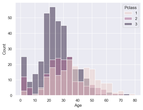
Say we want to plot the distribution of age separately in each travel class on the titanic.
We can do this using the “hue” argument in sns.histplot or sns.kdeplot:
sns.histplot(data=titanic, x='Age', hue='Pclass')
<Axes: xlabel='Age', ylabel='Count'>
Hm, that was a bit messy - it looks clearer as a kdeplot
# your code here to produce the KDEplot version of the above
You may notice in the KDEplot it appears as though there were many people with an age below zero.
Glance back at this histogram - you will see that there are not in fact any people with age <0, but there is a big spike in the passenger counts for young children, which gets smoothed out in the KDE plot resulting in the KDE plot extending below zero.
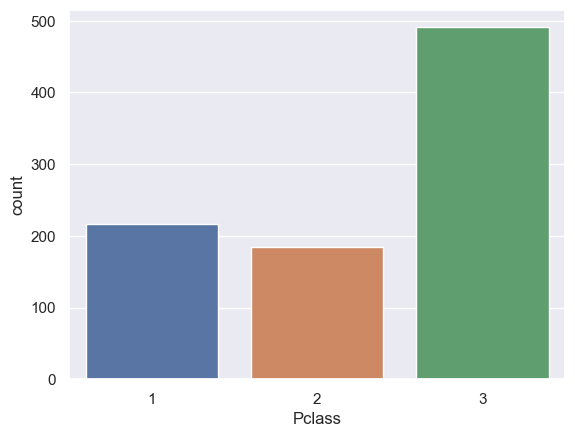
Countplot#
The simple plotting function sns.countplot shows the frequencies of different categories:
sns.countplot(data=titanic, x='Pclass')
<Axes: xlabel='Pclass', ylabel='count'>
… we can break the data down by a second category using the argument hue as follows:
sns.countplot(data=titanic, x='Pclass', hue='Survived')
<Axes: xlabel='Pclass', ylabel='count'>
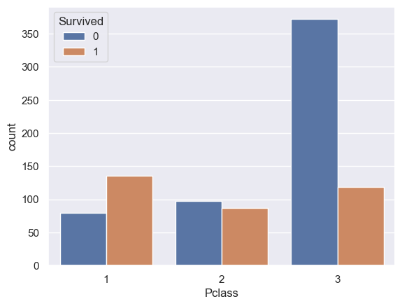
Hm, looks like being in 3rd class was not good news on the Titanic.
Barplot#
If we want to plot the mean value of a variable by category (rather than just the count in each category), we can use the function barplot
sns.barplot(data=titanic, y='Age', x='Pclass')
<Axes: xlabel='Pclass', ylabel='Age'>
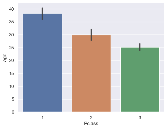
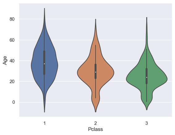
However, in many cases it will be more informative to plot a boxplot or violinplot
sns.violinplot(data=titanic, x='Pclass', y="Age")
<Axes: xlabel='Pclass', ylabel='Age'>
Once again you can use the argument hue to break the data down by another category
# Your code here for a barplot of age, broken down by class,
# and further broken down by whether the passenger survived -
# base it on the countplot example above
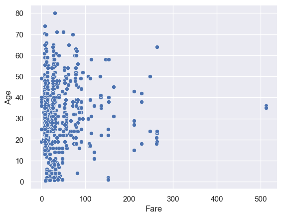
Scatterplot#
We can use similar tricks in a scatterplot.
Let’s plot a scatterplot of age against fare paid:
sns.scatterplot(data=titanic, x='Fare', y='Age')
<Axes: xlabel='Fare', ylabel='Age'>
# Your code here to repeat the scatterplot above but plotting different classes in different colours, using 'hue'