
4.6. Climate example#
Example#
We will look at a dataset containing carbon emissions, GDP and population for 164 countries (data from 2018).
These data are adapted from a dataset downloaded from Our World in Data, a fabulous Oxford-based organization that provides datasets and visualizations addressing global issues.
Set up Python libraries#
As usual, run the code cell below to import the relevant Python libraries
# Set-up Python libraries - you need to run this but you don't need to change it
import numpy as np
import matplotlib.pyplot as plt
import scipy.stats as stats
import pandas
import seaborn as sns
sns.set_theme() # use pretty defaults
Load and inspect the data#
Load the data from the file CO2vGDP.csv
CO2vGDP = pandas.read_csv('https://raw.githubusercontent.com/jillxoreilly/StatsCourseBook/main/data/CO2vGDP.csv')
display(CO2vGDP)
| Country | CO2 | GDP | population | |
|---|---|---|---|---|
| 0 | Afghanistan | 0.2245 | 1934.555054 | 36686788 |
| 1 | Albania | 1.6422 | 11104.166020 | 2877019 |
| 2 | Algeria | 3.8241 | 14228.025390 | 41927008 |
| 3 | Angola | 0.7912 | 7771.441895 | 31273538 |
| 4 | Argentina | 4.0824 | 18556.382810 | 44413592 |
| ... | ... | ... | ... | ... |
| 159 | Venezuela | 4.1602 | 10709.950200 | 29825652 |
| 160 | Vietnam | 2.3415 | 6814.142090 | 94914328 |
| 161 | Yemen | 0.3503 | 2284.889893 | 30790514 |
| 162 | Zambia | 0.4215 | 3534.033691 | 17835898 |
| 163 | Zimbabwe | 0.8210 | 1611.405151 | 15052191 |
164 rows × 4 columns
Aside - I notice that the GDP values contain loads of decimal places which makes them hard to read. Let’s just round those:
CO2vGDP['GDP']=CO2vGDP['GDP'].round()
display(CO2vGDP)
| Country | CO2 | GDP | population | |
|---|---|---|---|---|
| 0 | Afghanistan | 0.2245 | 1935.0 | 36686788 |
| 1 | Albania | 1.6422 | 11104.0 | 2877019 |
| 2 | Algeria | 3.8241 | 14228.0 | 41927008 |
| 3 | Angola | 0.7912 | 7771.0 | 31273538 |
| 4 | Argentina | 4.0824 | 18556.0 | 44413592 |
| ... | ... | ... | ... | ... |
| 159 | Venezuela | 4.1602 | 10710.0 | 29825652 |
| 160 | Vietnam | 2.3415 | 6814.0 | 94914328 |
| 161 | Yemen | 0.3503 | 2285.0 | 30790514 |
| 162 | Zambia | 0.4215 | 3534.0 | 17835898 |
| 163 | Zimbabwe | 0.8210 | 1611.0 | 15052191 |
164 rows × 4 columns
It is easier to comapre the values now as the larger GDPs actually take up more space!
Plot the data#
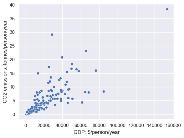
Let’s plot the data. A scatterplot is a good choice for bivariate data such as these.
sns.scatterplot(data=CO2vGDP, x='GDP', y='CO2')
plt.xlabel('GDP: $/person/year')
plt.ylabel('CO2 emissions: tonnes/person/year')
Text(0, 0.5, 'CO2 emissions: tonnes/person/year')
Let’s find the UK on that graph:
sns.scatterplot(data=CO2vGDP, x='GDP', y='CO2')
sns.scatterplot(data=CO2vGDP[CO2vGDP['Country']=='United Kingdom'], x='GDP', y='CO2',color='r') # see what I did there to plot the UK in red?
plt.xlabel('GDP: $/person/year')
plt.ylabel('CO2 emissions: tonnes/person/year')
Text(0, 0.5, 'CO2 emissions: tonnes/person/year')

Calculate the correlation#
We can calculate the correlation using the built in function pandas.df.corr()
CO2vGDP.corr()
---------------------------------------------------------------------------
ValueError                                Traceback (most recent call last)
Cell In[6], line 1
----> 1 CO2vGDP.corr()

File ~/opt/anaconda3/lib/python3.9/site-packages/pandas/core/frame.py:10054, in DataFrame.corr(self, method, min_periods, numeric_only)
  10052 cols = data.columns
  10053 idx = cols.copy()
> 10054 mat = data.to_numpy(dtype=float, na_value=np.nan, copy=False)
  10056 if method == "pearson":
  10057     correl = libalgos.nancorr(mat, minp=min_periods)

File ~/opt/anaconda3/lib/python3.9/site-packages/pandas/core/frame.py:1838, in DataFrame.to_numpy(self, dtype, copy, na_value)
   1836 if dtype is not None:
   1837     dtype = np.dtype(dtype)
-> 1838 result = self._mgr.as_array(dtype=dtype, copy=copy, na_value=na_value)
   1839 if result.dtype is not dtype:
   1840     result = np.array(result, dtype=dtype, copy=False)

File ~/opt/anaconda3/lib/python3.9/site-packages/pandas/core/internals/managers.py:1732, in BlockManager.as_array(self, dtype, copy, na_value)
   1730         arr.flags.writeable = False
   1731 else:
-> 1732     arr = self._interleave(dtype=dtype, na_value=na_value)
   1733     # The underlying data was copied within _interleave, so no need
   1734     # to further copy if copy=True or setting na_value
   1736 if na_value is not lib.no_default:

File ~/opt/anaconda3/lib/python3.9/site-packages/pandas/core/internals/managers.py:1794, in BlockManager._interleave(self, dtype, na_value)
   1792     else:
   1793         arr = blk.get_values(dtype)
-> 1794     result[rl.indexer] = arr
   1795     itemmask[rl.indexer] = 1
   1797 if not itemmask.all():

ValueError: could not convert string to float: 'Afghanistan'
Humph, population was included in my correlation matrix, which I didn’t really want.
The function pandas.df.corr() returns the matrix of correlations between all pairs of variables in your dataframe.
This isn’t a big problem in the current case, but if you had a big dataframe with many irrelevant columns, it would be an issue, because we don’t want the reader to have to search through a huge correlation matrix to find the correlation we are interested in.
We have two options to avoid this - one is to create a new dataframe with only the columns you want to correlate, like this:
CO2vGDP_reduced = CO2vGDP[['CO2','GDP']] # new dataframe has only columns 'CO2' and 'GDP'
CO2vGDP_reduced.corr()
| CO2 | GDP | |
|---|---|---|
| CO2 | 1.000000 | 0.795121 |
| GDP | 0.795121 | 1.000000 |
The other is to correlate just the two columns we want, rather than getting the whole correlation matrix:
CO2vGDP['CO2'].corr(CO2vGDP['GDP'])
0.7951213612309438
Outliers#
The correlation between GDP and C02 looks quite high, 0.79.
However, looking at our scatterplot, I can see a problem - there is one bad outlier with very high GDP and high CO2 emissions.
Any guesses what this country is?
We can find out by sorting the dataframe by GDP:
CO2vGDP.sort_values(by='GDP', ascending=False) # sort in descending order to put the richest country at the top
| Country | CO2 | GDP | population | |
|---|---|---|---|---|
| 122 | Qatar | 38.4397 | 153764.0 | 2766743 |
| 112 | Norway | 8.3307 | 84580.0 | 5312321 |
| 154 | United Arab Emirates | 16.0112 | 76398.0 | 9140172 |
| 133 | Singapore | 7.9898 | 68402.0 | 5814543 |
| 79 | Kuwait | 23.1008 | 65521.0 | 4317190 |
| ... | ... | ... | ... | ... |
| 108 | Niger | 0.0830 | 965.0 | 22577060 |
| 39 | Democratic Republic of Congo | 0.0331 | 859.0 | 87087352 |
| 85 | Liberia | 0.2252 | 818.0 | 4889396 |
| 21 | Burundi | 0.0608 | 651.0 | 11493476 |
| 26 | Central African Republic | 0.0471 | 623.0 | 5094795 |
165 rows × 4 columns
It’s Qatar - maybe not what you expected?
Remove outlier#
Let’s exclude Qatar from our dataset and re-calculate the correlation.
We erase the values for Qatar data values for CO2 and GDP for Qatar to Nan but in this case, since they are not misrecorded but just unusual values, let’s not do that, as we don’t want to hide the data point.
Instead we conduct the correlation on the dataframe excluding Qatar:
CO2vGDP[CO2vGDP['Country']!='Qatar'].corr()
| CO2 | GDP | population | |
|---|---|---|---|
| CO2 | 1.000000 | 0.732323 | 0.005751 |
| GDP | 0.732323 | 1.000000 | -0.025626 |
| population | 0.005751 | -0.025626 | 1.000000 |
Hm, the correlation went down from $r$=0.79 to $r$=0.073 - lower but still strong
Here’s a plot of the data with Qatar excluded
sns.scatterplot(data=CO2vGDP[CO2vGDP['Country']!='Qatar'], x='GDP', y='CO2')
plt.xlabel('GDP: $/person/year')
plt.ylabel('CO2 emissions: tonnes/person/year')
Text(0, 0.5, 'CO2 emissions: tonnes/person/year')
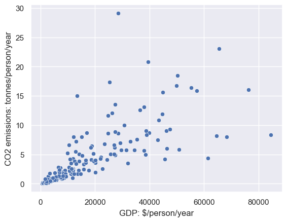
We no longer have an obvious outlier, but we do have a problem, called heteroscedasticity
Heteroscedasticty is when the variance of the data in $y$ depends on the value in $x$. In this case, CO2 emissions are more variable for high income countries (which can be high- or low poluting) compared to low income countries
This property violates the assumptions of Pearson’s correlation coefficient, so for these dataset we would be better off using Spearman’s rank correlation coefficient, as explored in the next section.