
2.9. Tutorial Exercises#
In these exercises you will practice:
Creating plots with Python
Choosing appropriate plots for the question at hand
Tweaking plots to make clear the important features of the data
Adding comments that make the interpretation of plots clear
We will use some of the example datasets provided with Seaborn
# Set-up Python libraries - you need to run this but you don't need to change it
import numpy as np
import matplotlib.pyplot as plt
import scipy.stats as stats
import pandas as pd
import seaborn as sns
sns.set_theme(style='white')
import statsmodels.api as sm
import statsmodels.formula.api as smf
2.9.1. 1. Titanic Data#
The Titanic dataset contains information on 891 passengers from the Titanic.
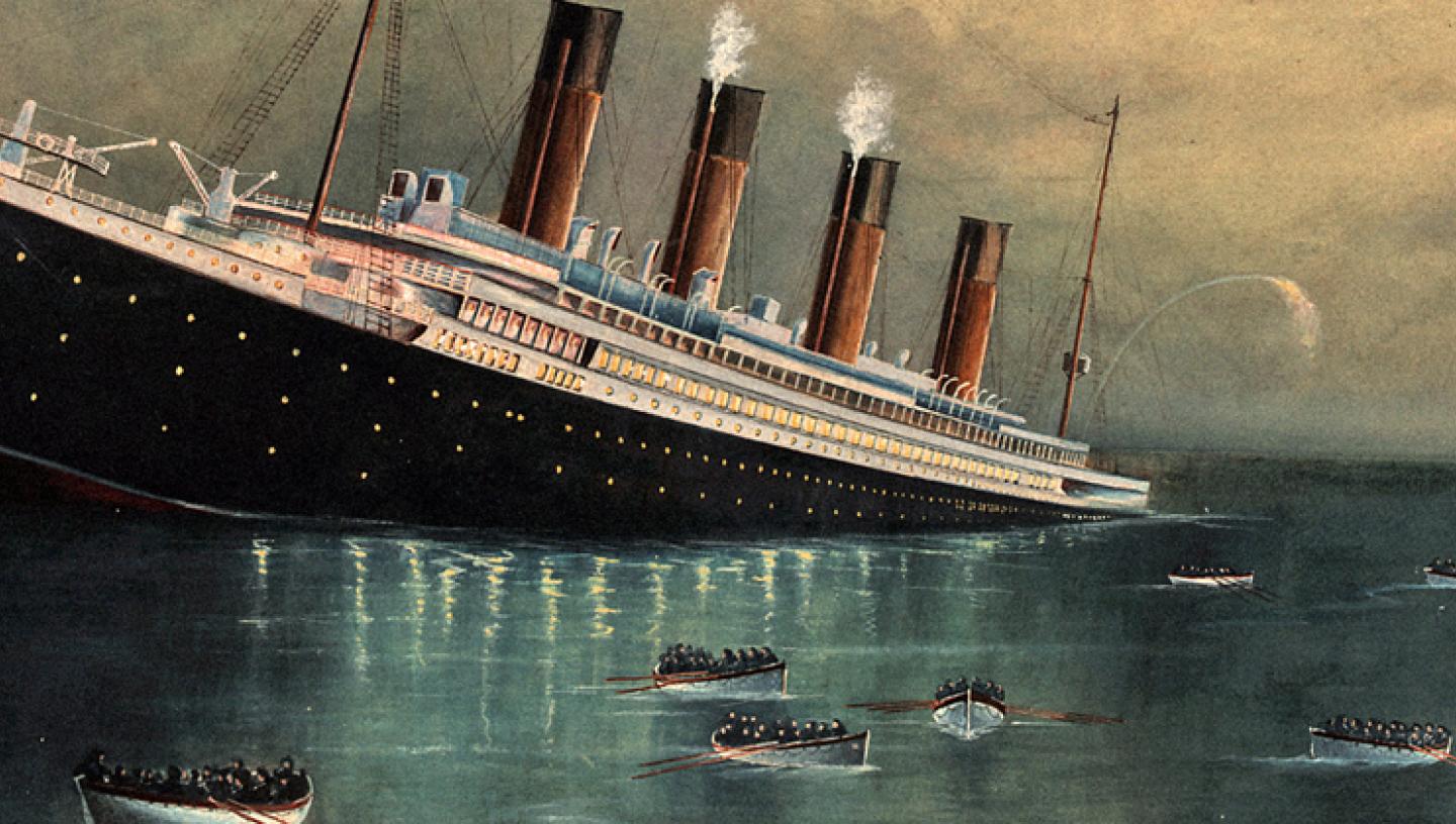
This is actually a popular dataset for people starting out with machine learning - the task is to build a model to predict who survived (you may like to try this yourself after commpleting the session on Logistic Regression after Easter).
For now let’s use some plot to look at the factors affecting survival.
The dataset contains the following information on each passenger:
survived 0 = No, 1 = Yes
pclass Ticket class - 1 = 1st, 2 = 2nd, 3 = 3rd
sex
age Age in years
sibsp number of siblings and/or spouses aboard the Titanic
parch number of parents / children aboard the Titanic
fare Passenger fare
embarked Port of Embarkation - C = Cherbourg, Q = Queenstown, S = Southampton
class Ticket class as a string
who man, woman or child
deck the deck on which they slept
alive same as survived, but strings
alone True only if sibsp and parch are zero
The Titanic dataset is supplied as one of the example datasets with Seaborn, so is stored on yuour computer with all the other files for Seaborn. We can load it using the special function sns.load_dataset()
# load the data - special syntax here for loading a Seaborn example dataset
titanic = sns.load_dataset('titanic')
titanic
| survived | pclass | sex | age | sibsp | parch | fare | embarked | class | who | adult_male | deck | embark_town | alive | alone | |
|---|---|---|---|---|---|---|---|---|---|---|---|---|---|---|---|
| 0 | 0 | 3 | male | 22.0 | 1 | 0 | 7.2500 | S | Third | man | True | NaN | Southampton | no | False |
| 1 | 1 | 1 | female | 38.0 | 1 | 0 | 71.2833 | C | First | woman | False | C | Cherbourg | yes | False |
| 2 | 1 | 3 | female | 26.0 | 0 | 0 | 7.9250 | S | Third | woman | False | NaN | Southampton | yes | True |
| 3 | 1 | 1 | female | 35.0 | 1 | 0 | 53.1000 | S | First | woman | False | C | Southampton | yes | False |
| 4 | 0 | 3 | male | 35.0 | 0 | 0 | 8.0500 | S | Third | man | True | NaN | Southampton | no | True |
| ... | ... | ... | ... | ... | ... | ... | ... | ... | ... | ... | ... | ... | ... | ... | ... |
| 886 | 0 | 2 | male | 27.0 | 0 | 0 | 13.0000 | S | Second | man | True | NaN | Southampton | no | True |
| 887 | 1 | 1 | female | 19.0 | 0 | 0 | 30.0000 | S | First | woman | False | B | Southampton | yes | True |
| 888 | 0 | 3 | female | NaN | 1 | 2 | 23.4500 | S | Third | woman | False | NaN | Southampton | no | False |
| 889 | 1 | 1 | male | 26.0 | 0 | 0 | 30.0000 | C | First | man | True | C | Cherbourg | yes | True |
| 890 | 0 | 3 | male | 32.0 | 0 | 0 | 7.7500 | Q | Third | man | True | NaN | Queenstown | no | True |
891 rows × 15 columns
Let’s first have a look at who the passengers were
a. Were there equal numbers of men and women in each class?
# Your code here
b. What was the age distribution in each class?
You could use a violin plot or a histogram here
Which is better and why?
# Your code here
c. Were people in some classes more likely to survive?
You could use countplot or barplot here.
Which is better and why?
# your code here
d. Were women and children more likely to survive?
Again you could use countplot or barplot here.
Which is better and why?
# your code here
e. Does the answer to d) depend on the ticket class?
As you are now plotting a barchart with data breoken down by two categorical variables, you will need to set one as x and one as hue.
Try it both ways and see which you think is better.
# your code here!
2.9.2. 2. Penguin data#
How can we recognise penguins of different species? Let’s look at the Palmer Penguins dataset which contains data on penguins from three species (Artwork by @allison_horst):

We can see that they differ in the shape of their bills, and their size.
Let’s load the data
penguins = sns.load_dataset('penguins')
penguins
| species | island | bill_length_mm | bill_depth_mm | flipper_length_mm | body_mass_g | sex | |
|---|---|---|---|---|---|---|---|
| 0 | Adelie | Torgersen | 39.1 | 18.7 | 181.0 | 3750.0 | Male |
| 1 | Adelie | Torgersen | 39.5 | 17.4 | 186.0 | 3800.0 | Female |
| 2 | Adelie | Torgersen | 40.3 | 18.0 | 195.0 | 3250.0 | Female |
| 3 | Adelie | Torgersen | NaN | NaN | NaN | NaN | NaN |
| 4 | Adelie | Torgersen | 36.7 | 19.3 | 193.0 | 3450.0 | Female |
| ... | ... | ... | ... | ... | ... | ... | ... |
| 339 | Gentoo | Biscoe | NaN | NaN | NaN | NaN | NaN |
| 340 | Gentoo | Biscoe | 46.8 | 14.3 | 215.0 | 4850.0 | Female |
| 341 | Gentoo | Biscoe | 50.4 | 15.7 | 222.0 | 5750.0 | Male |
| 342 | Gentoo | Biscoe | 45.2 | 14.8 | 212.0 | 5200.0 | Female |
| 343 | Gentoo | Biscoe | 49.9 | 16.1 | 213.0 | 5400.0 | Male |
344 rows × 7 columns
a. Are males bigger than females?
Plot the mean bodyweight for each sex
Plot the distribution of bodyweights of each sex
# your code here!
What did we learn by plotting the distribution? Can you make a further plot to explore this discovery?
# your code here!
Looks like
All species have a similar sex difference as a proportion of their size
Indeed one species is larger - Gentoos are the big ones
b. Is there a correlation between beak length and depth?
Plot the data in a way that answers this question.
# your code here
Do you notice some clusters in the plot? How could they be explained?
Modify your plot using the ‘hue’ argument to test your hypothesis.
Summarize your findings in plain English.
# your code here
2.9.3. 3. Parietal neurons dataset#
I mentioned that Seaborn was built by a neuroscientist, Michael Waskom, and a couple of the example datasets are from neuroscience.
Here we explore the dots dataset, from a study by Roitman and Shadlen (2002). This study contains firing rates over time from neurons in the parietal cortex of a monkey performing a perceptual decision-making task.
In the task, the monkey observes a random dot kinematogram - a stimulus containing dots that mainly move about at random. A small proportion of dots move coherently upwards of downwards.

The monkey’s task is to indicate the direction in which the dots are moving - instead of pressing a button, the monkey moves its gaze to one of two targets on the screen:
up = move eyes to target T1
down = move gaze to target T2
The explanation for this dataset is somewhat involved (although PPL and BMS students will in fact cover this study in lectures after Christmas) but it may be helpful to see the following figure, which is what we are eventually aiming for:
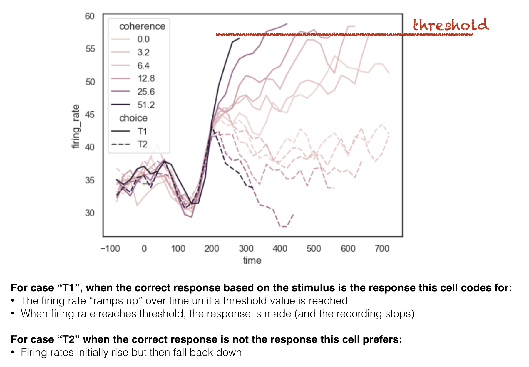
We are going to try and reproduce this figure
Let’s start by loading the data and plotting the timeseries:
dots = sns.load_dataset('dots') # this syntax only works for the Seaborn example datasets
dots
| align | choice | time | coherence | firing_rate | |
|---|---|---|---|---|---|
| 0 | dots | T1 | -80 | 0.0 | 33.189967 |
| 1 | dots | T1 | -80 | 3.2 | 31.691726 |
| 2 | dots | T1 | -80 | 6.4 | 34.279840 |
| 3 | dots | T1 | -80 | 12.8 | 32.631874 |
| 4 | dots | T1 | -80 | 25.6 | 35.060487 |
| ... | ... | ... | ... | ... | ... |
| 843 | sacc | T2 | 300 | 3.2 | 33.281734 |
| 844 | sacc | T2 | 300 | 6.4 | 27.583979 |
| 845 | sacc | T2 | 300 | 12.8 | 28.511530 |
| 846 | sacc | T2 | 300 | 25.6 | 27.009804 |
| 847 | sacc | T2 | 300 | 51.2 | 30.959302 |
848 rows × 5 columns
The dataset contains timeseries alligned to two timepoints:
stimulus onset (align == ‘dots’)
response (saccade) onset (align == ‘sacc’)
We are going to split the dataframe and deal with these separately:
dots_stimulus = dots.query('align == "dots"')
dots_response = dots.query('align == "sacc"')
Let’s start with the stimulus-locked data.
a. Plot the timeseries data: firing rate over time
# Your code here
Time zero is the onset of the moving dots. We can see that firing rate initially dips, then rises over the course of several hundred milliseconds.
what do your notice about the variability in firing rate?
Could some of this variability be explained by the other variables in the dataset?
b. Separate firing rates for chosen and unchosen target
Parietal neurons are tuned to locations in space. It turns out that each neuron is more active when an eye movement is planned towards its prefered target.
This dataset is coded such that T1 is always the preferred location of the cell being recorded.
T1 is actually a different location in space for each neuron!
On some trials T1 is chosen, and on other trials T2 (a non-preferred location) is chosen.
Let’s plot these separately using the hue argument:
# Your code here
What do you see? Describe the graph in words.
c. Effect of task difficulty
The difficulty of the task, and hence the time needed to reach a decision, depends on the proportion of coherent motion (ie what % of dots are moving to the right, or left, rather than randomly)
When only a small percentage of dots are moving coherently, the monkey needs to stare at the stimulus for a long time to work out whether the dots are moving left or right.
Let’s try breaking down the traces by level of coherence
coherence = % dots moving left (or right) rather than randomly
You previously used hue (line colour) to break down the data by the choice (T1/T2). You can use style (different line styles) to further break down the data.
# Your code here
d. Explore use of hue and style to best represent the data
If you used hue = choice and style = coherence above, try switching these.
# Your code here
I think this plot shows the structure in the data much more clearly than the one in part c.
What makes it clearer?
which is more striking - colour (hue) or linestyle (style)
which more clearly conveys an ordering (from low to high coherence) - colour or line style?
e. Plot data aligned to response
The traces for T1 trials all seem to end when the firing rate reaches about 60Hz - this happens earliest for high coherence trials.
The reason the traces end is because at this point, the monkey releases an eye movement.
Now let’s plot the data aligned to the response, which we put in a separate dataframe way back at the start of this section. You can use the same plot style as in part d.
# Your code here
Focussing on trials in which choice == T1, we see:
Aligining the data the the response brings the point at which each trace reaches threshold (60Hz firing rate) into line.
Now we see the trace for low-coherence trials stretches further back in time than those for short coherence trials (this is the effect is also seen in the stimulus-locked plot)
f. Compare plots of stimulus- and response-locked data
Let’s use plt.subplot() to plot the stimulus and response-locked data.
Would it be best to plot the data one above the other, or side by side? Why?
Think about what needs to match between the axes to facilitate comparison
Do you need to adjust the figure size to make enough space for both subplots?
# Your code here
Note-
From the stimulus-locked graph, it looks like the neurons are ramping up to a threshold.
Paired with the response-locked graph, this result is extremely convincing. This is because of the aligned peaks and the sudden drop-off of firing rate after the threshold is reached.
Aside-
You might have noticed that the threshold/peak looks higher in the response-locked graph! This looks a bit odd.
It is because the traces in the stimulus-locked graph are truncated 100ms before response onset.
Check what the firing rate is at time -100ms in the response-locked graph (hopefully similar tho the traces’ end-points in the stimulus-locked plot)