3.9. Preparing a report#
As a researcher or data scientist, your ultimate ‘product’ is often quite a compact report summarizing the key findings from your survey or experiment. For example, a research scientist might produce a journal article with just 3-4 figures ot convey the results of a complex study. A statistician or data scientist would produce a report of a few hundred words for a client (such as a company CEO, civil servant or politician).
However, the production of the report is preceded by an exploratory phase in which you need to get to know the data, in order to work out what to put in the report. In the case of scientific research, this phase typically lasts several months (!).
Therefore there are two distinct phases to data analysis:
Understanding the dataset yourself - this involves making lots of quick plots and descriptive statistics to
check for outliers
find out the data distributions
look for differences between categories
look for associations between variables
Preparing a report for a reader - this involves a focus on readability and the reader
explain any key features of the dataset
highlighting key results with descriptive statistics and figures
explain your comclusions succinctly
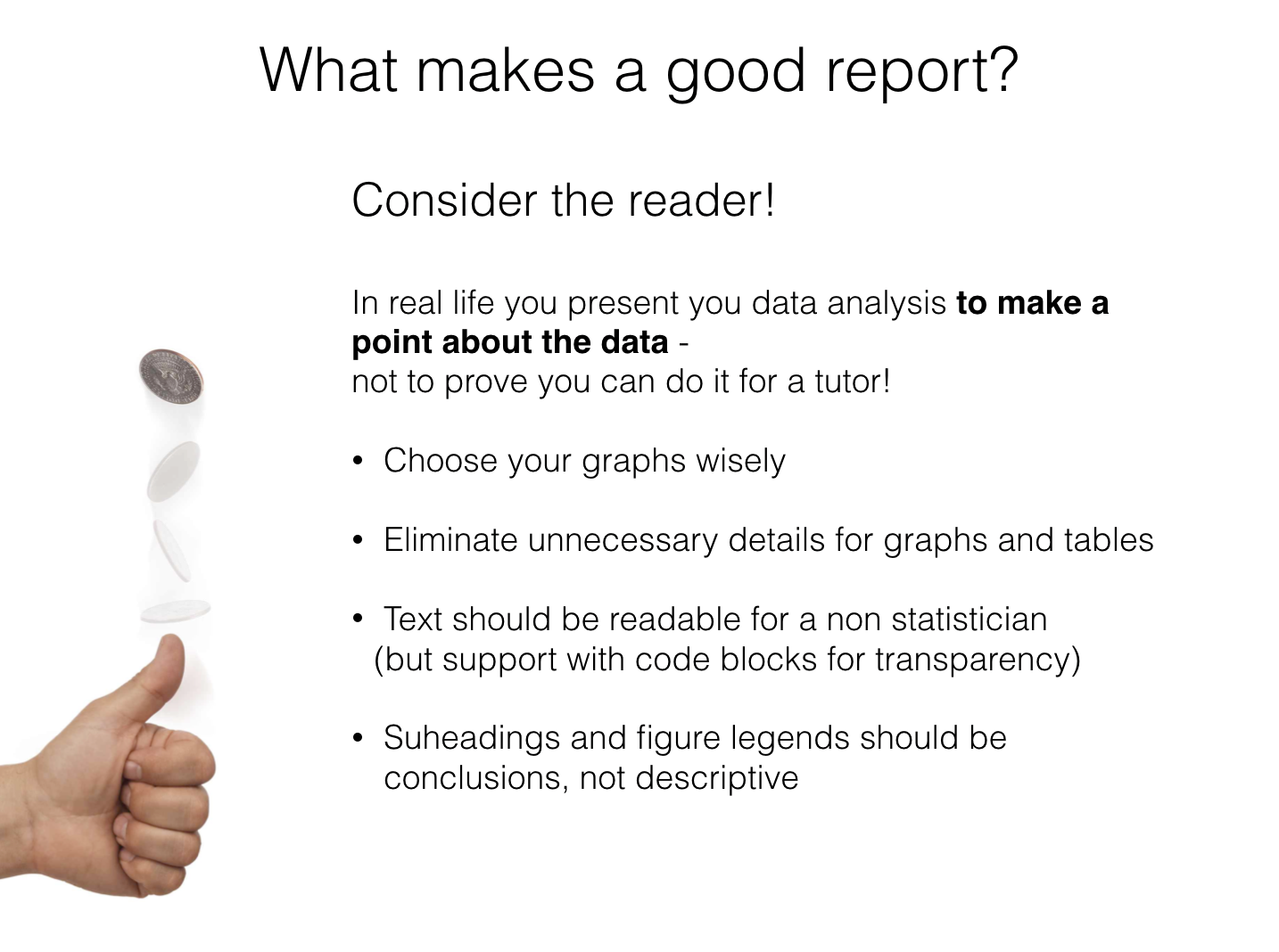
To write a good report, it is essential to consider the reader and the message or conclusions
The reader is (in most cases) not statistically trained, therefore:
non-technical language should be used as far as possible
jargon (especially things like incomprehensible variable names take straight from a data table) should be avoided.
All figures and statistics given are there to support your message or conclusions.
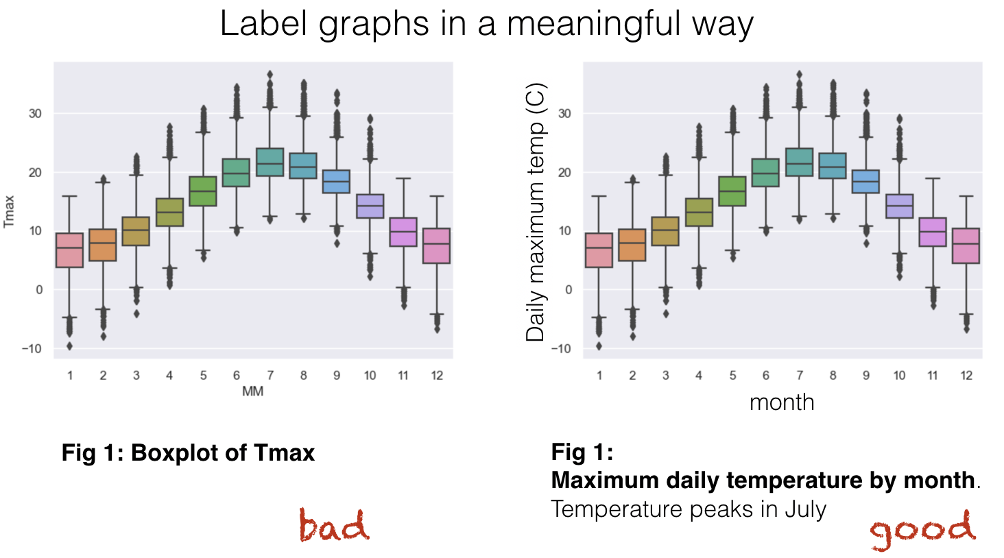
figure titles should summarize the point being made by the figure
figures should be accompanied by text explaining what the reader is supposed to learn from the figure
figures should be well labelled and ‘tweaked’ (use of colours, range of axes, etc etc) to make your point as clearly as possible
3.9.1. Examples of good practice#
The UK’s Office for National Statistics is a public body that collects and analyses all sorts of data concerning the UK and life in the UK.
They produce accessible reports which can be viewed on their website. These are a great example for how to present your data - note that the style points suggested above are all implemented in the ONS reports.
You could have a look at this one on the wellbeing of young people in the UK as an example
3.9.2. This week#
In this week’s tutorial exercises, you will complete some guided tasks (and some open-ended ones) to explore a dataset for yourself.
For the hand-in assignment, you will produce a report on the same dataset for a specified reader. This will be produces in the form of a Jupyter notebook but should be written as if to be read by a client (ie, format it nicely, and don’t leave mess and junk in there!)
3.9.3. Example Report#
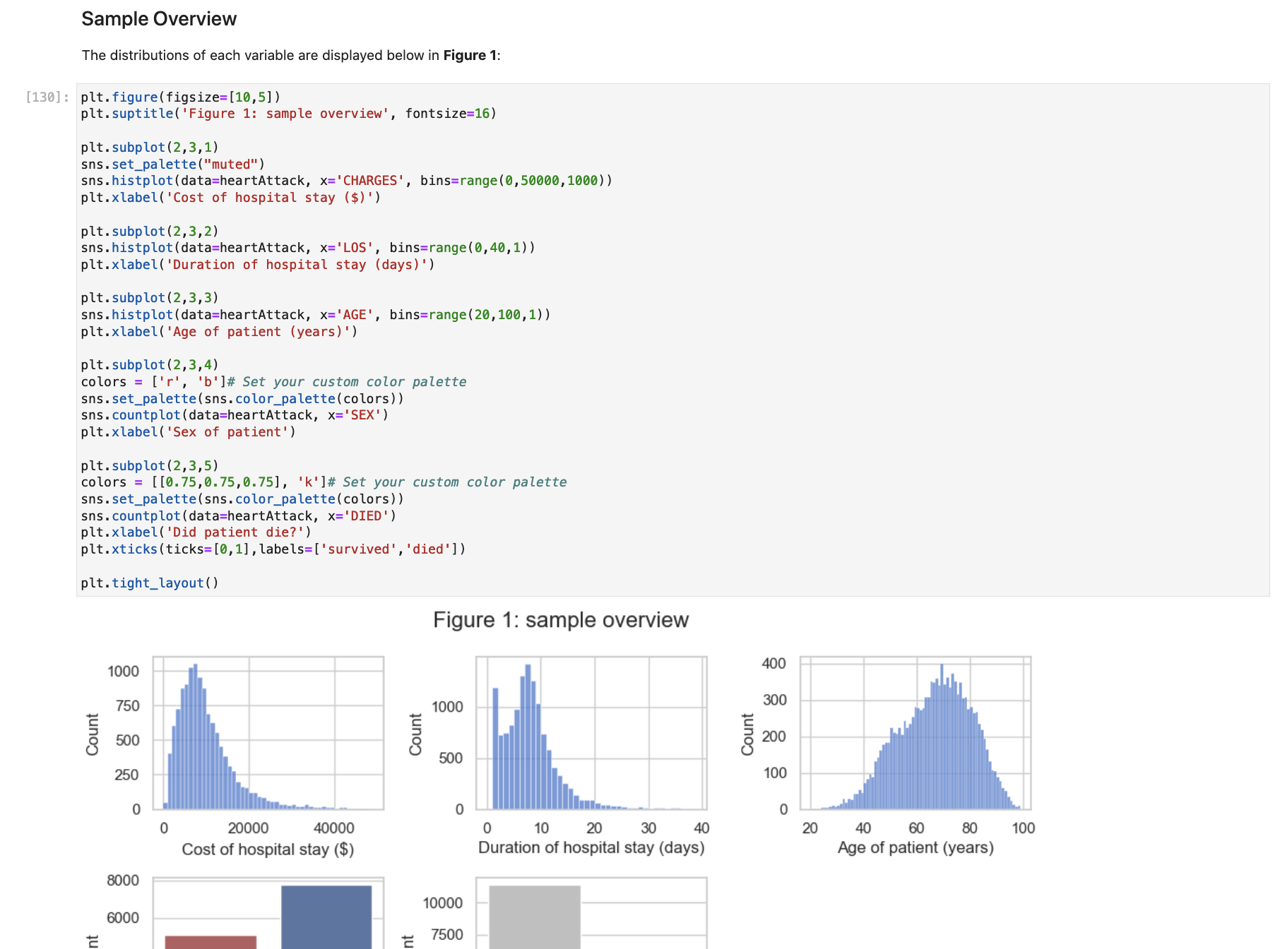
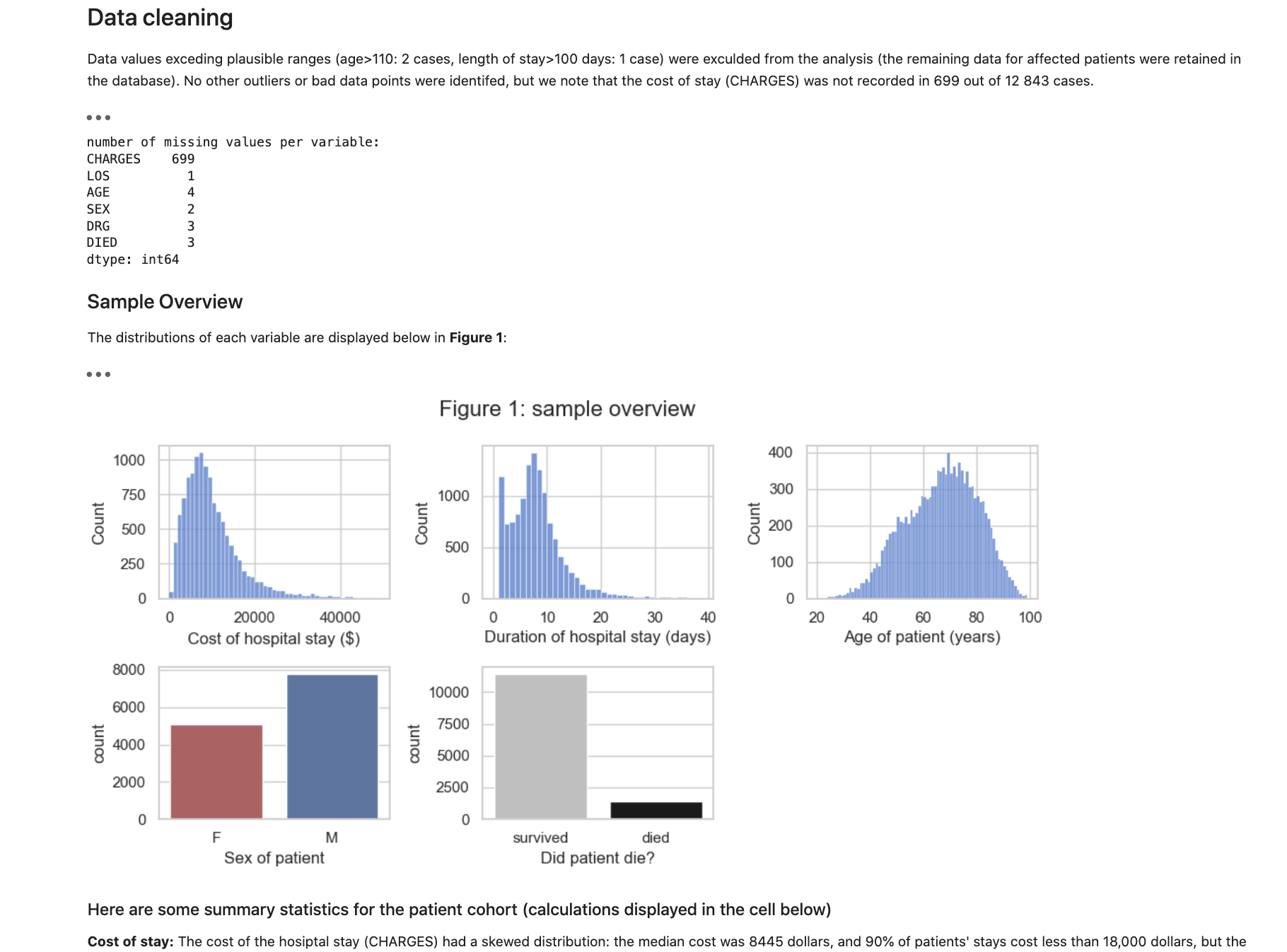
You may find it helpful to view an example ‘report for a client’ based on the Heart Attack dataset which we visited in the reading this week; the brief was to write a short report summarizing the factors that affect the dollar cost of hospital stays, for the CEO of Medicare. An example report is included as the next page in these course notes.
NOTE - hiding the code
The nice thing about Jupyter Notebooks is that your code is in there, so anyone can check and reproduce your analysis process. However, in general you don’t want your report cluttered up with code which may be confusing or distracting for a client. You can hide the code in JupyterLab by clicking View–>Collapse all code. In Colab, collapse individual cells by clicking the cell, then View—>Show/hide code
I recommend you aim for a report which is readable and user friendly once the code has been collapsed; try collapsing the code in the example report on the next page to see what I mean here!
A snippet with code collapsed:
The same thing with code not collapsed - all this code is not what you would like to show to the CEO of Medicare!