
3.3. Locating bad datapoints#
In this notebook we cover:
Approaches for locating outliers
Replacing missing data with NaN (how to do it; what choices we need to make)
Outliers, by definition, have extreme values (very large or very small values). Therefore if a dataset contains outliers this can distort the calculated values of statistics such as the mean and standard deviation
In real datasets, outliers are common, often arising from one of the following causes:
Real but unusual values
many basketball players are outliers in terms of height
Noise in a data recording system
in brain imaging data, motion artefacts generated by head movements (MRI) or blinks (EEG) are much larger than the real brain activity we are trying to record
Data entry error
a human types the wrong number, uses the wrong units or misplaces a decimal point
Dummy values
In some datasets an ‘obvioulsy wrong’ numerical value, such as 9999, is used to indicate a missing datapoint
Identifying and removing outliers and bad data points is a crucial step in the process of preparing our data for analysis, sometimes called data wrangling
3.3.1. Set up Python Libraries#
As usual you will need to run this code block to import the relevant Python libraries
# Set-up Python libraries - you need to run this but you don't need to change it
import numpy as np
import matplotlib.pyplot as plt
import scipy.stats as stats
import pandas as pd
import seaborn as sns
sns.set_theme(style='white')
import statsmodels.api as sm
import statsmodels.formula.api as smf
3.3.2. Import a dataset to work with#
We will work with the file heartAttack.csv, which contains data on several thousand patients admitted to hospital in New York City, diagnosed with a heart attack.
From this dataset we can explore how demographic and disease factors affect the duration of stay in hospital and the dollar cost of treatment.
The dataset are downloaded with thanks (and with slight modifications for teaching purposes) from the website DASL (Data and Story Library)
The data will be automatically loaded fromt he internet when you run this code block:
hospital=pd.read_csv('https://raw.githubusercontent.com/jillxoreilly/StatsCourseBook_2024/main/data/heartAttack.csv')
display(hospital)
| CHARGES | LOS | AGE | SEX | DRG | DIED | |
|---|---|---|---|---|---|---|
| 0 | 4752.00 | 10 | 79.0 | F | 122.0 | 0.0 |
| 1 | 3941.00 | 6 | 34.0 | F | 122.0 | 0.0 |
| 2 | 3657.00 | 5 | 76.0 | F | 122.0 | 0.0 |
| 3 | 1481.00 | 2 | 80.0 | F | 122.0 | 0.0 |
| 4 | 1681.00 | 1 | 55.0 | M | 122.0 | 0.0 |
| ... | ... | ... | ... | ... | ... | ... |
| 12839 | 22603.57 | 14 | 79.0 | F | 121.0 | 0.0 |
| 12840 | NaN | 7 | 91.0 | F | 121.0 | 0.0 |
| 12841 | 14359.14 | 9 | 79.0 | F | 121.0 | 0.0 |
| 12842 | 12986.00 | 5 | 70.0 | M | 121.0 | 0.0 |
| 12843 | NaN | 1 | 81.0 | M | 123.0 | 1.0 |
12844 rows × 6 columns
The columns of the dataframe are:
CHARGES - dollar cost fo treatment
LOS - length of hospital stay in days
AGE - patient age in years
SEX - patient’s biological sex
DRG - a code noted on dischaarge fromm hospital
DIED - 1 if the patient died, 0 if they survived
3.3.3. Finding outliers#
When working with a new dataset it is always necessary to check for missing data and outliers. There are a couple of ways of checking:
Check min/max values are plausible#
df.describe()
Often if there is an outlier or misrecorded data point, the outlier will be the minimum or maximum value in a dataset:
If the decimal point is misplaced we get a very large (or small value) - eg a person’s height could easily be misrecorded as 1765 cm (over 17 metres!) instead of 176.5 cm
If the wrong units are used we could get a very large or small value - eg a person’s height is recorded as 1.756 (m) when it should have been recorded as 176.5 (cm)
sometimes ‘dummy’ values are used as placeholders for missing data - often the dummy value is
NaNbut sometimes an obviously-wrong numerical value (such as 99, 999 or 9999) is used, which will generally be a large number compared to real numerical values.Occasionally 0 will be used as a placeholder value for missing data. This is generally a bad idea, as zero is often a plausible value for real data. If a variable has a large nummber of zero values, it is worth considering whether these could be missing data rather than real zeros.
Because outliers are often the max or min value, running df.describe() and checking the min and max values for each datapoint is a good first step in checking for outliers
Let’s try it with our hospital dataset:
hospital.describe()
| CHARGES | LOS | AGE | DRG | DIED | |
|---|---|---|---|---|---|
| count | 12145.000000 | 12844.000000 | 12842.000000 | 12841.000000 | 12841.000000 |
| mean | 9879.087615 | 8.345765 | 67.835072 | 121.690523 | 0.109805 |
| std | 6558.399650 | 88.309430 | 124.700554 | 0.658289 | 0.312658 |
| min | 3.000000 | 0.000000 | 20.000000 | 121.000000 | 0.000000 |
| 25% | 5422.200000 | 4.000000 | 57.000000 | 121.000000 | 0.000000 |
| 50% | 8445.000000 | 7.000000 | 67.000000 | 122.000000 | 0.000000 |
| 75% | 12569.040000 | 10.000000 | 77.000000 | 122.000000 | 0.000000 |
| max | 47910.120000 | 9999.000000 | 9999.000000 | 123.000000 | 1.000000 |
I can see something suspicious!
The max values for length of stay (LOS) is 9999 days (about 3 years)
The max value for Age (AGE) is 9999 years
It looks like 9999 may have been used as a dummy value for missing data.
Plot the data#
What about the column CHARGES?
The maximum value of $48910.12 is horrifyingly high, but as we are (hopefully) unfamiliar with medical billing, it is hard to say if this is an outlier
The minimum value of $3 is also suspect, did they just give the patient a paracetomol and send them on their way?!
To get a clearer picture we can plot the distribution of CHARGES:
sns.histplot(data=hospital, x='CHARGES')
plt.show()
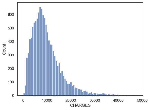
Hm, the distribution of costs is skewed, but the maximum value of 49000 dollars appears to just be the ‘tip of the tail’ rather than an actual outlier. The minimum value of 3 dollars is also not particularly unique. I wouldn’t exclude any outliers from CHARGES.
How will I know if it is a real outlier?#
One way is to plot the data. You can then tell ‘by inspection’ (by looking at the graph) whether any datapoints seem to be separated from the main body of the data distribution.
Look what happens when we plot the distribution of Length of Stay:
plt.figure(figsize=(8,3)) # when I first plotted this it looked a bit squashed so I adjusted the figsize

plt.subplot(1,2,1)
sns.histplot(data=hospital, x='LOS', bins=20, color=[0.5,0.5,0.5])
plt.title('a. Raw data')
plt.xlabel('Length of Hospital Stay (days)')

plt.subplot(1,2,2)
sns.histplot(data=hospital.query('LOS < 365'), x='LOS', bins=20, color=[0.5,0.5,0.5])
plt.title('b. Stays over 1 year removed')
plt.xlabel('Length of Hospital Stay (days)')

plt.tight_layout()
plt.show()
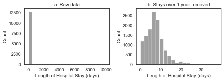
Panel a (raw data) tells us that the values of length of stay extend up to 10000
we can’t see the bar at 9999 because only a few datapoints have this value compared to 12500 real datapoints,
however, we can see that the axis has autoscaled to accommodate values up to 10000, suggesting tehre is at least one datapoint stranded up there near LOS=10000
the autoscaling is a hint to use as data scientists that there are outlier values.
It’s not a good way to present this fact to a client unfamiliar with
Seaborn’s quirks!this is the kind of plot you make for yourself, not something you put in a report
In panel b, I excluded stays over one year from the dataframe and replotted - I chose the cut-off value of 1-year arbitrarily. However, I can see from panel b that no values even approach 1 year, so I am happy with my choice of cut-off retained all real values of length of stay and removed the outliers
Have a look at the code block above to see how I excluded the cases where LOS>365
Use a ‘standard’ cut-off#
Sometimes it’s not so clear where the boundary is between real data and outliers.
In this case, researchers sometimes define outliers as those lying more than 3 standard deviations from the mean.
Under the normal distribution, values 3 standard deviations from the mean occur about 1/1000 of the time so the 3xSD cut-off should exclude relatively few real values
If your data are not Normally distributed, this cutoff may be less suitable.
Don’t worry if you don’t know what normal distribution is yet - this will make sense when you come back and revise!
We can calculate the 3SD cutoff for CHARGES:
m = hospital.CHARGES.mean()
s = hospital.CHARGES.std()

cutoff = [m-3*s, m+3*s]

display(cutoff)
[-9796.111336261178, 29554.286565573653]
# re-plot the hisptogram so we can see where the 3SD cut-off falls
sns.histplot(data=hospital, x='CHARGES')
plt.show()
By this criterion, charges below -9800 dollars and above 30000 are considered outliers.
These are not good cut-off values!
Looking again at the histogram of CHARGES above, 30001 dollars seems no less plausible than 29999
-9800 dollars is an impossible value so wouldn’t exclude any cases anyway!
The 3SD approach didn’t work so well in this case because the data distribution is very skewed, so high positive values are actually quite plausible, whilst the natural cut-off value for low CHARGES (zero dollars) is not very far from the mean (in fact the minimum possible value, zero, is within the 3SD cutoff).