
2.6. 2D Data: Correlation and Pairwise Effects#
In some datasets, the key point of interest is the relationship between two variables. Important experimental examples would be:
paried designs (where pairs of participants are compared, to balance out external variables - for example:
patients and control participants may be matched on age and sex
Repeated measures designs, where the ame participant completes all conditions in the experiment
A patient’s blood pressure before and after taking a drug
Reaction time on the same task with and without distraction
If we want to see the relationship between paired measurements, we need a type of plot that shows that relationship. Good examples are:
scatterplot
sns.scatterplot()scatterplot with regression line
sns.regplot()2D histogram
sns.histplot()2D KDE plot
sns.kde()
2.6.1. Example: brother/sister heights#

A researcher hypothesises that men are taller than women.
He also notices that there is a considerable genetic influence on height, with some families being taller than others
He decides to control for this by comparing the heights of brothers and sisters (shared genetic influence, shared upbringing). This is a paired design.
I have provided some made-up data
Set up Python libraries#
As usual, run the code cell below to import the relevant Python libraries
# Set-up Python libraries - you need to run this but you don't need to change it
import numpy as np
import matplotlib.pyplot as plt
import scipy.stats as stats
import pandas as pd
import seaborn as sns
sns.set_theme(style='white')
import statsmodels.api as sm
import statsmodels.formula.api as smf
Load and inspect the data#
Load the file BrotherSisterData.csv which contains heights in cm for 25 fictional brother-sister pairs
heightData = pd.read_csv('https://raw.githubusercontent.com/jillxoreilly/StatsCourseBook_2024/main/data/BrotherSisterData.csv')
display(heightData)
| brother | sister | |
|---|---|---|
| 0 | 174 | 172 |
| 1 | 183 | 180 |
| 2 | 154 | 148 |
| 3 | 172 | 180 |
| 4 | 172 | 165 |
| 5 | 161 | 159 |
| 6 | 167 | 159 |
| 7 | 172 | 164 |
| 8 | 195 | 188 |
| 9 | 189 | 175 |
| 10 | 161 | 160 |
| 11 | 181 | 177 |
| 12 | 175 | 168 |
| 13 | 170 | 169 |
| 14 | 175 | 165 |
| 15 | 169 | 164 |
| 16 | 169 | 163 |
| 17 | 180 | 176 |
| 18 | 180 | 176 |
| 19 | 180 | 172 |
| 20 | 175 | 170 |
| 21 | 162 | 157 |
| 22 | 175 | 172 |
| 23 | 181 | 179 |
| 24 | 173 | 171 |
Independent KDE plots#
Let’s use a KDE plot to compare the heights of the men (brothers) and women (sisters) in the sample.
We can call KDE plot twice to plot the data from brothers and sisters overlayed
sns.kdeplot(data=heightData, fill=True)
plt.xlabel('height (cm)')
Text(0.5, 0, 'height (cm)')
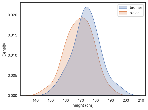
There’s a lot of overlap for sure, and just a hint that the men are taller than the women.
But comparing all the men to all the women is wasting the power of our paired design! We deliberated measured brother-sister pairs in the hope of “cancelling out” shared genetic or environmental influences within families. We therefore need to ask if each brother is taller than his own sister.
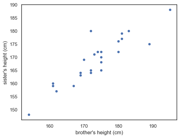
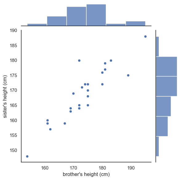
2.6.2. Scatterplot#
On a scatterplot, each dot represents two people - a brother and sister:
sns.scatterplot(data=heightData, x='brother', y='sister')
plt.xlabel("brother's height (cm)")
plt.ylabel("sister's height (cm)")
plt.show()
Between-pairs effect (correlation)#
Notice that in the scatterplot, the data points are spread out along a diagonal line, or to put it another way, height of brothers and sisters is correlated across families.
This means that in general tall brothers have tall sisters and this variation between families rather dwarfs the effect of interest (that within each family the brother is taller than his own sister)
This feature of the plot is evidence that a paired design was a particularly good choice for this question - in the paired design, the (large) variation between families is cancelled out allowing us to detect the (small) difference between male and females.
Within-pairs effect (pairwise difference)#
The family effect is actually “noise” in this study - what we really want to know is not whether some families are taller than others, but whether the male sibling in each family is taller than the female sibling once the family effect is accounted for (by compaaring only within families).
To help us visualise this we add a reference line.
Reference line#
If all the brothers were exactly the same height as their sisters, we would expect all data points to fall exactly on the line \(x=y\)
If brothers were roughly the same height as their sisters (with some random variation) we would expect the data points to fall equally often above and below the line \(x=y\)
If brothers are generally taller than their sisters, most of the datapoints will fall on one side of the line (think about which!)
To add the line \(x=y\) we use the matplotlib function plt.plot(). The arguments of this function are the \(x\) and \(y\) values for the ends of the line (\(x\) and \(y\) both range from 150-190), and the argument ‘r–’ which sets the color and line type.
sns.scatterplot(data=heightData, x='brother', y='sister')
plt.xlabel("brother's height (cm)")
plt.ylabel("sister's height (cm)")
plt.plot([150, 190],[150, 190], 'r--')
plt.show()
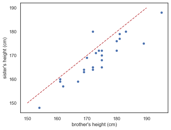
Look at the graph - most of the datapoints fall on one side of the line (below it)
This means either than most of the brothers are taller than their sisters, or vice versa - which is it (look at the graph)?
Exercise#
See if you can add another line of code to draw a red horizontal line at y=170
Reference line is not a regression line#
More commonly, when you see a line on a scatter plot, the line is a regression line (more detail below). It can be helpful to add other reference lines, such as the line \(x=y\), but I suggest you use obvious colouring (eg a red dashed line) to distinguish them from a regression line, and clearly state in the figure description (ie the text under the figure) that the red dashed line is the line \(x=y\) for reference
2.6.3. Scatterplot with regression line#
Sometimes we are interested in the between-pairs effect. For example we might be interested in the shared effect of genetics/environment, and would like to make a prediction along the lines ‘for each additional cm in height of the brother, we expect the height of his sister to increase by 0.8cm’
We will cover regression analysis later in the course
Here I just want to introduce a version of the scatterplot which includes the best fitting regression line, sns.regplot()
sns.regplot(data=heightData, x='brother', y='sister')
plt.plot([150, 190],[150, 190], 'r--')
plt.xlabel("brother's height (cm)")
plt.ylabel("sister's height (cm)")
plt.show()
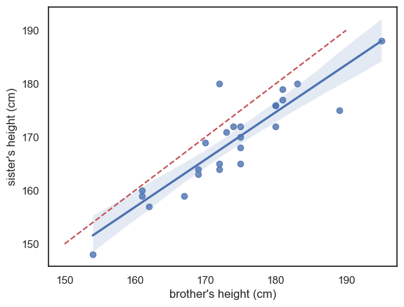
The blue line is the regression line (and the shading represents a confidence interval for the regression line - we will cover confidence intervals in detail later but basically, it reflects the fact that we are not totally sure this sample reflects all men and women in the popluation; we expect the ‘true’ regression line to fall somewhere in the shaded region)
I’ve also included (red dashed line) the line \(x=y\) for reference - we can see that the regression line is not the same as the line \(x=y\) - it falls to one side of \(x=y\) and has a slightly different slope.
If these ideas (regression line and confidence interval) are unfamiliar please think no more about it - they will be covered later in the course, but I mention this plot here so you have all commonly used plots in one chapter for revisiobn.
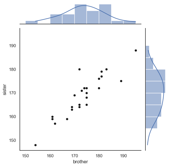
2.6.4. Jointplot#
A disadvantage of the scatterplot is that we lose the ability to see the shape of each distribution (brothers’ and sisters’ heights), which we would get from a histogram or KDE plot
is the distribution of heights symmetrical or skewed?
is the distribution unimodal or bimodal
We can get ‘the best of both worlds’ by using seaborn function jointplot, which shows the marginal distributions (the height distributions for brothers and sisters separately) at the side of the main scatter plot
sns.jointplot(data=heightData, x='brother', y='sister')
plt.xlabel("brother's height (cm)")
plt.ylabel("sister's height (cm)")
plt.plot()
[]
Since this plot is now made up of three axes (the main scatter plot and the two marginal histograms), if we want to adjust one of those axes, we use a set of arguments in a dictionary:
marginal_kwsare keyword argumments for the marginal histogramsjoint_kwsare keyword arguments for the scatterplot itself
You can probably just copy this syntax without worrying too much about understanding it as we don’t make heavy use of dictionaries in this course.
sns.jointplot(data=heightData, x='brother', y='sister', kind='scatter',
              marginal_kws=dict(bins=range(150,200,5), kde="true"),
              joint_kws=dict(color='k'))
plt.show()
Finally, we can add the line \(x=y\).
This is a little fiddly and you will not be required to do this in an assessment - however I include it for your future reference
As the plot consists of several axes, we have to tell the computer which part of the the joint plot to add the line to, by getting a handle to the plot (see comments in the code)
# create the joint plot as before but give it a label - "myfig"
myfig = sns.jointplot(data = heightData, x='brother', y='sister', kind='scatter',
                      marginal_kws=dict(bins=range(150,200,5), kde="true"),
                      joint_kws=dict(color='k'))

# plot the line x=y onto the joint axis (ax_joint) of myfig
myfig.ax_joint.plot([150,190],[150,190],'r--')

plt.show()

2.6.5. 2D Histogram#
The functions sns.histplot() and sns.kde() can actuaally be used for two dimensional data.
Here is a histplot for our brother-sister height data, with the scatterplot overlaid:
sns.histplot(data=heightData, x='brother', y='sister', bins=range(150,200,5))
sns.scatterplot(data=heightData, x='brother', y='sister', color='k')

plt.show()
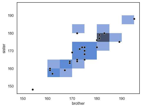
… Note that areas (squares) with more data points in them are darker blue.
Large datasets#
A 2D histogram or KDE plot is particularly useful when a dataset is too large to be successfully visualized using a scatterplot.
For example, consider the following dataset containing heights, weight and gender for 10,000 (fictional) people.
hws = pd.read_csv('https://raw.githubusercontent.com/jillxoreilly/StatsCourseBook_2024/main/data/weight-height.csv')
display(hws)
| Gender | Height | Weight | |
|---|---|---|---|
| 0 | Male | 73.847017 | 241.893563 |
| 1 | Male | 68.781904 | 162.310473 |
| 2 | Male | 74.110105 | 212.740856 |
| 3 | Male | 71.730978 | 220.042470 |
| 4 | Male | 69.881796 | 206.349801 |
| ... | ... | ... | ... |
| 9995 | Female | 66.172652 | 136.777454 |
| 9996 | Female | 67.067155 | 170.867906 |
| 9997 | Female | 63.867992 | 128.475319 |
| 9998 | Female | 69.034243 | 163.852461 |
| 9999 | Female | 61.944246 | 113.649103 |
10000 rows × 3 columns
Let’s try making a scatterplot of the data:
sns.scatterplot(data=hws, x='Height', y='Weight')
plt.show()
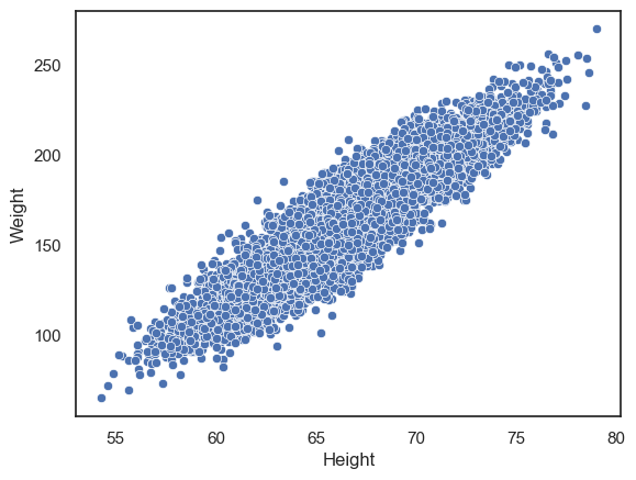
We can clearly see a positive correlation between weight and height, but it is hard to see any detail about the relationship as the dots are packed so closely together.
We can try instead to plot a 2D histogram:
sns.histplot(data=hws, x='Height', y='Weight')
plt.show()
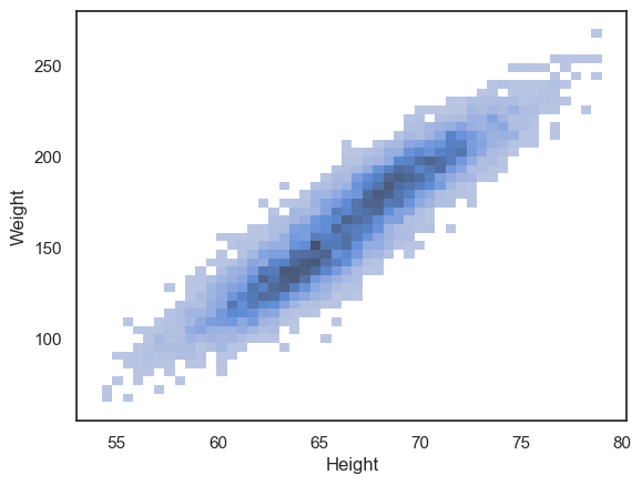
We can now see that the density of datapoints is higher in the middle of the cloud, and interestingly can see a hint that there are two separate peaks within the data distribution (look closely - the dark region of the histogram dips in the middle).
The reason for this becomes clearer if we plot the data separately for men and women:
sns.histplot(data=hws, x='Height', y='Weight', hue='Gender')
plt.show()
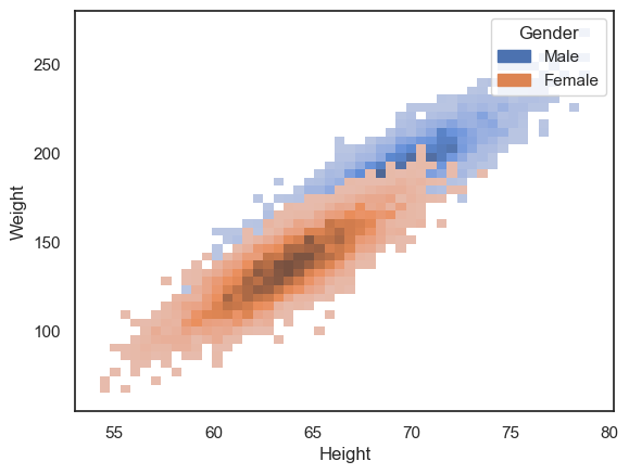
However, the data cloud for women is now occluding the data cloud for men.
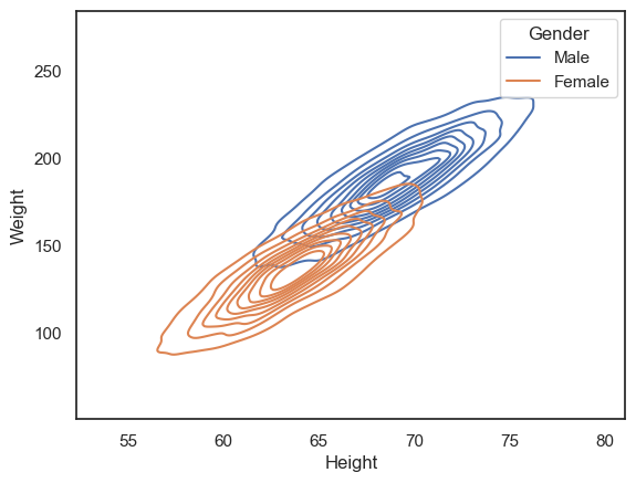
Another option is to use the 2D KDE plot, which produces a kind of contour map (equivalent to the kind fo map you would take hill walking):
sns.kdeplot(data=hws, x='Height', y='Weight', hue='Gender')
plt.show()
Customization#
All the plots above can be customized to highlight features of interest in the data.
Particularly relevant tweaks for these plot types are:
alpha- a number between 0 and 1 - makes plots semi-transparent when close to 0colormap
You can learn more on the seaborn reference pages for sns.histplot(), sns.kdeplot() and sns.scatter().